

This guide will take you from zero to one in creating a single source of truth for your UX content in the form of a copy library. It covers how to add, organize, edit, and reuse copy components in a library, to help you and your team collaborate effectively and write consistently.
Copy Components are the building blocks of the copy library. If you are still not familiar with this feature, we invite you to read this first.
Create or import copy components
The first step in creating a library, is to componentize your UX content. Components help you group together similar texts, sync changes across instances in multiple design files or code repositories, and reuse copy without reinventing the wheel every time.

Create components from project texts
If you haven't imported your designs using Frontitude's design tool plugin, read this guide to learn how to do that.
Since Frontitude is a design-driven content management system, the best way to create components is from texts imported from the design using Frontitude’s design tool plugin. This way allows you to collaborate on, edit, and reuse these components with the full design context.
Once you have texts imported into a Frontitude project (or projects), you can create components in a few ways:
Using component suggestions
Frontitude scans every imported text and matches it with existing texts to allow you to create components more quickly. If similar texts are found, it creates suggestions for components in the design tool plugin and web app (it works exactly the same).
- Whenever a component suggestion is available, it will be shown in the Edit tab (in the Figma plugin) or in the Edit panel (in the web app)
- Click View instances to view all the associated texts that will be converted into instances once the component will be created
- Once you’re ready, click Attach or create
- A dropdown will be opened. Use the standard naming convention (see more information about it down below) to search for an existing component or name a new one
- Click one of the existing components, if found, or the Create <component name> button to attach or create a new component
You can always create a new component from any imported text, both from the design tool and copy library:
In copy library
The copy library allows you to see all component suggestions in your workspace in a single place. This is the quickest way to create components out of the imported texts.
- Open the Component suggestions tab
- All component suggestions will be listed in a single feed. Click View instances to go over all the texts that Frontitude suggests you to create a component from.
- If you would like to exclude a text from the soon-to-be-created component, click Exclude from suggestion
- Once you’re done with checking the texts, click Create component to create the component
- To help you ensure an organized library, a dropdown will be opened, with the option to name and categorize the newly created component. Use the standard naming convention (see more information about it down below) to search for an existing component or name a new one
- Once created, you’ll be able to open the component in the library by clicking Open component
In Figma
- Open the Figma plugin
- Select a text element in Figma. If the text is not imported, read first on how to Upload content to Frontitude
- Open the Edit tab
- Click Attach or create a component
- A dropdown will be opened. Use the standard naming convention (see more information about it down below) to search for an existing component or name a new one
- Click one of the existing components, if found, or the Create <component name> button to attach or create a new component
In a project
- Open a project
- Select a text to open the edit panel
- In the edit panel on the right, click Attach or create a component
- A dropdown will be opened. Use the standard naming convention (see more information about it down below) to search for an existing component or name a new one
- Click one of the existing components, if found, or the Create <component name> button to attach or create a new component
Once a component is created, each and every new imported text that shares the same value with an existing component will be automatically attached to it using Frontitude’s auto-attach mechanism.
More information about how to create and manage copy components can be found in this guide.
Create from the library
It is possible to create a component directly from the copy library for components that have no reference in the design, such as error messages, empty states, alt text, etc.
- Open your Copy library
- Click on New Component at the top of the page
- Fill in the following fields:
Text value - This one is the actual copy text
Name (recommended) - The name of the newly created component. Although it is optional, we highly recommend giving the component a meaningful name, following our supported naming convention (see more information about it down below) - Click Create
- This component is now added to the library under the specified category (if no category was included in the name, it’s stored as Uncategorized)
Import components from a file
Frontitude lets you import copy components from the codebase, localization tools, or other external sources, straight into your copy library.
- Open the Copy Library
- On the top of the screen, click on the Options menu (three dots), and choose Import from file
- You can either click on browse or simply drag and drop and JSON file into the droppable area
- Once the file upload has been completed, Frontitude will display the number of valid entries that have been detected in the selected file
- Click Import to start the import process. Once it’s finished, you’ll get the number of components created. Notice that this process can take a while for large files
- By default, the imported copy will be stored as Uncategorized and wait for you to be categorized
More information about importing copy components from files can be found in this guide.
Organize components into categories
Once you have reached the point where you have a few components, it’s about time to sort it out, and ensure an organized library to allow quick and efficient access and component reuse.
The copy library supports a hierarchy of up to 3 categories, nested under each other. Using categories is essential to maintain an organized library at scale.
Manage categories
Creating categories can be done in a few ways:
In the copy library
- To create a top-level category, click on the Options menu (three dots) on the top of the screen, and choose Create category. To create a subcategory, use the category’s Options menu (three dots) that is shown for each category at any level
- A new category should appear in the main library grid. Click its name to edit it to something meaningful and press Enter when you’d like to save it
In the edit panel
- Select a component from the library
- From the edit panel on the right, click Add category, if no categories have been defined for this text, or the + button to create subcategories
- A dropdown will be opened. Type the desired category name. If no existing category is found for typed name, click Create <category name> to create the category
Category naming convention
To help you build an organized copy library, we have applied a naming convention inspired by design tokens. After all, UX content is a design asset and should be structured as such.
The copy library supports this convention natively, and we recommend following it. By following this convention, you can organize copy in a nested structure, giving your team a better overview and reusability throughout all of Frontitude's integrations.
Frontitude supports the following naming convention:
Primary / Secondary / Tertiary / Component Name
Once set, the values between the slash delimiters will be converted into categories, while the last part will be always converted into the component name.
Examples of good component names:
- Message / Success / Added to cart
- Message / Error / Plans / Reached plan limit
- Button / CTA / Book now
Integrate your content guidelines (or style guide)
Besides being a single source for actual content, the copy library also serves as a single source for documentation and for storing a style guide for this content.
Rich text guidelines
You can store rich text guidelines and notes in Frontitude. It means that you can use text styles (bold, italics, etc.), organize content in bulleted lists, and link to external assets, like design files or product/content specs.
Add content guidelines
Frontitude allows you to add guidelines and notes on each category level down to the component level. For example, you can set separate guidelines for all of your button labels, call-to-action button labels, and a specific call-to-action button.
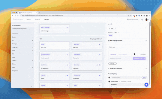
Add category guidelines
- Next to each category name, click Add guidelines to open the guidelines rich text box
- Insert the relevant guidelines for this category and click Save once you’re done
- To edit guidelines, click the rich text box. This will switch it to edit mode. Insert your edit and click Save
- To delete the guidelines, click the rich text box, delete its content, and click Save
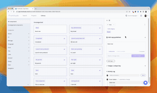
Add component guidelines
- Select a component from the library
- From the edit panel on the right, click Add copy guidelines
- Insert the relevant guidelines for this category and click Save once you’re done
- To edit guidelines, click the Pencil icon. This will switch it to edit mode. Insert your edit and click Save
- To delete the guidelines, click the Trash icon
Edit component properties, such as status, tags, and more
To maintain an organized copy library, Frontitude allows to update component properties, such as status, tags, and category in bulk.
- Hover a component card to view a checkbox at the top-left corner of it
- Click the checkbox to select a component
- An action bar should be displayed at the bottom of the screen, allowing you to update all component properties in bulk
- Select as many components as you wish using their checkboxes or click Select all to select all components in the view. Tip: Once in multi-select mode, you can select components by clicking anywhere in the card, and not necessarily the checkboxes
- Use the action bar displayed at the bottom of the screen to edit the properties of the selected components
Delete components
- Hover a component card to view a checkbox at the top-left corner of it
- Click the checkbox to select components
- From the action bar at the bottom of the screen, click Delete
- In the opened dialog box, click Delete to delete all of the selected components
When deleting a component, its instances will not be deleted, but detached. All component properties will be lost.
Search and filter components
You can browse the library to find a specific component, view all components under a specific category, view components in review, and more.
All these actions are available from the library’s main search and filter bar. From this bar, you can do the following:
- Search by value - From the main search bar, select Search by value (selected by default) left to the search input and type a search query
- Search by unique key - From the main search bar, select Search by key (selected by default) left to the search input and type a search query
- Filter by with/without unique key - View components with or without unique key set. This is useful to map all component that haven’t been set with a key, which is critical to the developer/localization handoff
- Filter by status - View components with a specific status. This is useful for filtering components that are pending review, for example
- Filter by tag - View all components with a specific tag. This is useful for filtering components that are part of a design component, or specific parts of the product (for example, all texts that are related to payment, or a specific user journey)
View all component instances
Frontitude is a design-driven content management system, therefore allowing you to view the design at each stage of the workflow.
You can view the component instances in the design to fully understand the context of each instance, and decide if you’d like to detach irrelevant instances.
In the copy library
- If a component has instances attached, you’ll see a Mountain icon at the top-right corner of the component card. Click this icon to view all instances in the design
- Navigate through the instances using the keyboard arrows (←→)
In the component edit panel
- Select a component to open the edit panel
- Click the Options menu at the top-right corner of the edit panel
- If a component has instances attached, you’ll see the View all instances option. Click it to view all instances in the design
- Navigate through the instances using the keyboard arrows (←→)
Export and share library content
Whether it’s the developer handoff, sending copy for translation, or sharing content with the legal team, you can export content from the library to share it with teammates and stakeholders.
Export to a file
- On the top of the screen, click on the Options menu (three dots), and choose Export library
- The export dialog will be opened. Select the format and options for the export, then click the Export as <format> button at the bottom of the dialog box
More information about exported file formats including samples can be found in the CSV and JSON format guides.
Fetch library content using the Developer CLI
Developers can connect the copy library in Frontitude to their codebase to automatically fetch updates directly from their development environment.
- Setup the Developer CLI by following this guide
- When selecting the source for the codebase connection, select the copy library
- From now on, every change submitted to any of the library’s components can be automatically fetched using the Developer CLI
More information about setting up the Developer CLI can be found here.

