

This guide explains how you can organize your Copy Library in Frontitude to ensure you and your team have a clear overview of your product's copy. Utilizing these practices also makes it easier for all team members to reuse copy during the design phase, as well as with other Frontitude integration.
💡 Copy Components are the building blocks of the Copy Library. If you are still not familiar with this feature, we invite you to read this first.
Copy Library is the single source for your product copy
Frontitude’s Copy Library is a copy repository where you store all your repeated copy. It stores all texts, documentation, discussions, and more in one place. This allows other members of your team to consume the content and integrate it with their workflows via Frontitude's integrations. One of the integrations is the design tool integration, which enables you to reuse Copy Components directly from the design tool.
Use a consistent naming convention for better organization
To help you build an organized copy repository, we have applied a naming convention inspired by design systems. After all, product copy is a design component and can be structured as such.
The Copy Library supports this convention natively, and we recommend following it. By following this convention, you can organize copy in a four-level hierarchy, giving your team a better overview and reusability through Frontitude's integrations.
Frontitude supports the following naming convention:
Primary / Secondary / Tertiary / Component Name
- When you create a new category, Frontitude will automatically suggest existing categories from your library to make sure you don’t create duplicates.
- You can change the name of the Primary/Category at any time.
Using this structure, the Copy Library lists all components on a four-level hierarchy interface, making navigation and organization much easier.
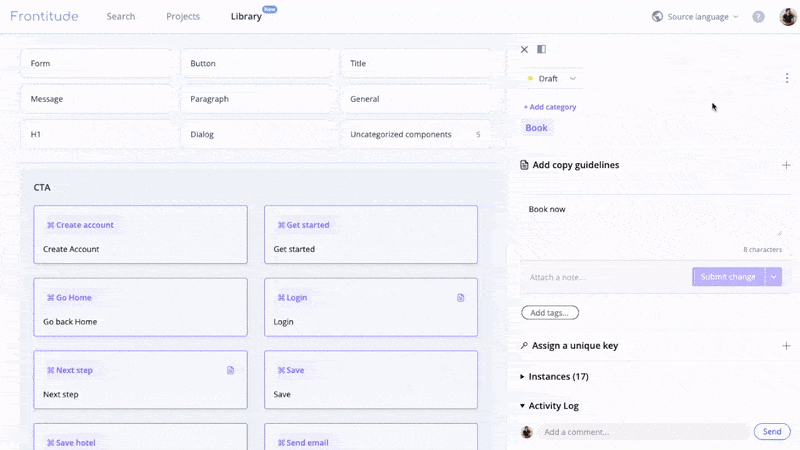
Add guidelines or notes to each category in your library
Add content guidelines and notes to each category in your copy library to ensure product language consistency. For example, the Message / Error category can include the following guidelines: “Clearly explain the situation and how it can be resolved. Don’t use overly dramatic or scary words for simple errors.”.
To add guidelines, do the following:
- Open Frontitude's web app
- Open your Library
- Hover over one of your component categories, and on the right side, the +Add guidelines button will appear.
- Add your guidelines and notes for each category to make sure the entire team is aligned.
Other recommended rules to keep
- We suggest sentence casing for each of the name parts, although it isn't mandatory.
- We don’t recommend using camelCase or kebab-case conventions since they are more difficult to search.
- Use singular nouns to define the Category part. This is more intuitive when attaching a text element to a component. For example - Use Button, not Buttons. Message, not Messages.
Examples
Here are a few examples of component names that can be a great use of the conventions we introduced:
- Message / Success / Added to cart - An info message pops up after an item is successfully added to the shopping cart.
- Message / Error / Reached plan limit - An error message that pops up once the user has reached their current plan limit.
- Empty state / Shopping cart / Title - The title of the shopping cart’s empty state.
- Button / CTA / Book now - A call-to-action button in a hotel booking app.
- Button / Sign in - A generic component that can be used as a call-to-action button or a navigation button label.
- Navigation / Home - A navigation button label that can appear in the web app navigation bar, or on the 404 page as a link button to navigate to the home page.

